
 |
| 2022 NHL Reverse Retros |
The NHL and adidas designed another set of Reverse Retros for all 32 teams. Some of these designs are really good, some are really bad. No one asked for this, but here is my opinion on the 2022 Reverse Retros. I have no qualifications, so feel free to disagree with my opinion. Starting with the Atlantic Division, since all the teams have debuted their new jerseys on the ice.
 |
| Boston Bruins |
Boston Bruins - 8/10
Has there been a bad Bruins jersey? Well, yes. But this is not one of them. This one works on many levels. It brings back the 90's third jersey with the bear, this time in white. Yeah, it looks like an MTV Liquid Television version of a bear that is about to attack Aeon Flux, but who cares...it works. The jagged shoulder yokes and sides look like claws, or rips...rips by claws.
Number and letter placement works, as well as the font, classic. The 'Bruins' shoulder patch is just enough to bring everything together. Plus, they Bruins have set an NHL record for longest home win streak, with only a handful of losses so far. This is all thanks to a pretty good jersey design. The Winter Classic jersey, on the other hand, is another story.
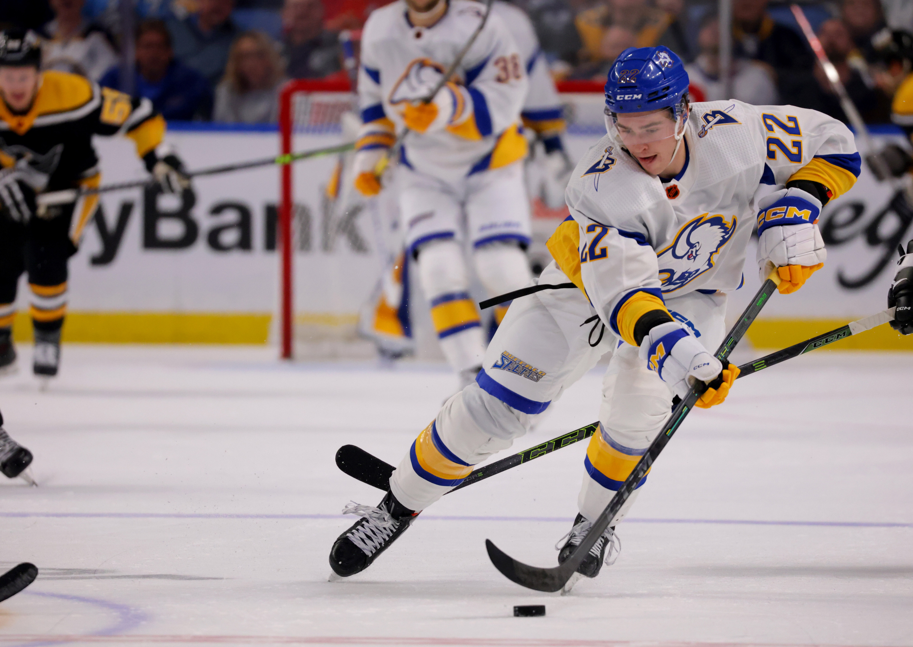 |
| Buffalo Sabres |
Buffalo Sabres - 6/10
Dude, what the hell is going on here? There is too much white. At the same time, not enough white. The jersey itself it okay. Very simple, they took the red/black buffalo head jersey and gave it the blue/gold treatment. As a jersey alone, it works. But we judge on the whole package. This is why I waited until the entire uniform is on the ice.
The problem here is the helmet, it needs to complements something. Maybe have white helmets so everything is white. Then strap on some Oakland Seals (foreshadowing) white skates and you may have something. How about blue pants to work with the blue helmet. The little blue strip on the hem breaks things up at little, but it needs more contrast. Call me crazy, but how about blue pants with yellow helmet? The white gloves work.
 |
| Detroit Red Wings |
Detroit Red Wings - 4/10
This is the problem when your team only has two colours...well, really one colour. In Detroit's case, red. So, what do you do? You add a 'neutral' colour like black, sometimes grey or silver. This is black/red is throwback one of their original Detroit Cougars design...which was red/white, of course...and 'retro-ed' during 1991-92 Season for NHL's 75th Anniversary.
Another 'issue' with the Red Wings' jersey history is, they kind of only have one design. A very iconic design. The early jersey, or sweater, designs were usually simple striping, achieved by changing the yarn as it is knitted. The classic striping is a tradition that is seen in hockey jerseys since. Bro, you guys need a real secondary logo. Heck, even a risky third jersey with a goofy logo, like...an octopus.
One nice detail, instead of just a letter, the captain's "C" is on a patch. And...for the first time in a while on the correct side of the chest. Damn it, do not get me started on C/A placement.
 |
| Florida Panthers |
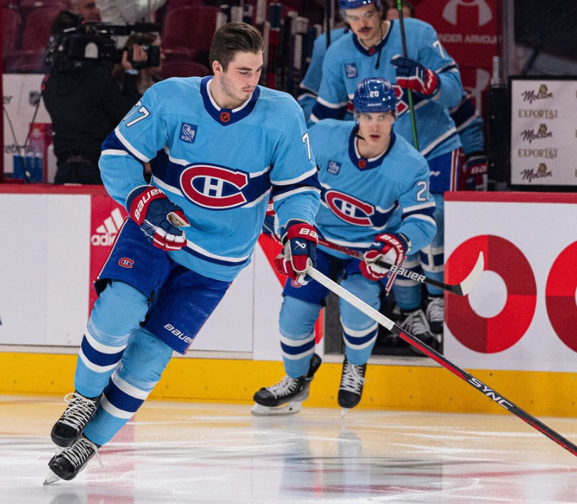 |
| Montreal Canadiens |
Montreal Canadiens - 7/10
Oh, so close. Overall, very good. Like Detroit, Montreal is limited in retro selection as their jersey design has not really changed through out the years. Here they try to use a light blue. While for the most part, it works simply for trying a new colour, it needs a little more to really make it pop.
A little red to bring everything together. Perhaps outlining the numbers and letters. Or, maybe...dear I say it, at another stripe. Again, the design follows the same layout as every jersey in their history, handcuffed by tradition. Also, Florida wins the light blue jersey battle.
 |
| Ottawa Senators |
 |
| Tampa Bay Lightning |
 |
| Toronto Maple Leafs |
No comments:
Post a Comment