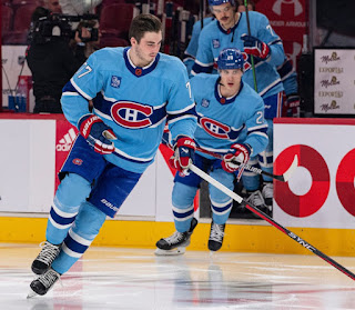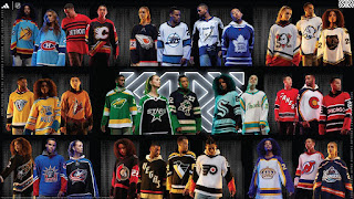
Showing posts with label Hockey. Show all posts

01 March 2023

2022 NHL Reverse Retro Jerseys - Pacific Division


2022 NHL Reverse Retros

Finally, the Pacific Division.  After this, I will be done...and you will not have to read about my stupid opinions.  At least, until the next Reverse Retros come out.  Less work for me, as there was a lot of research just looking for good images of these uniforms in action.  Less work for you, of course, you can just skip this for something way more interesting.  But, there will be some interesting facts and theories in this entry.  

Anaheim Ducks

Anaheim Ducks - 8/10

Admit it, the Disney logo is the better logo. Another all-time-great logo in sports.  People whined about Disney buying a hockey team to promote a movie.  Yeah, so?  It takes years and a lot of money to start an NHL franchise.  Disney just one day said, "hey, how about we promote this mediocre movie franchise by starting a hockey team...in Southern California?"  And, they did!  Bonus, they had some of the best designers in the world designing the logo and uniform.  Although, if I know my licensors, I am sure the designs went through thousands of rounds of changes. 

Pretty much anytime a team goes with orange, green, and/or purple, you have a winning combo.  Heck, the original colours of the Mighty Ducks were green and purple...sorry, "jade and eggplant".  

Oh, the design.  Anaheim has a good history of design.  Yes, even the Wild Wing jersey is awesome!  Why else would that be their first Reverse Retro?  The lone not-so-good design is the wordmark logo.  But, they fixed that by just using the more legible D logo.  This season's Reverse Retro, is a good execution using the logo and template of their original uniform, but replacing it with current colour pallet.  Again, the orange is key here.  The Ducks could have easily (and lazily) stayed with black pants, but those orange pants are fire!  These uniforms pop on ice.

Another reason to love this logo...it is the one worn by Paul Kariya!


Calgary Flames

Calgary Flames - 8/10

Ah, the pedestal jersey.  Back in the mid 1990's, a new technology allowed ink to be laser printed on fabric.  Which, for teams in the NHL, jerseys with whacky stripes and not limited to traditional basic  horizontal striping (or major change in the template).  Coming out of the lockout shortened season, the Calgary Flames were one of the teams that used this new technology and gave us the pedestal.  The pedestal jersey era was the dark years for the Flames. 

While I am not a fan of black uniforms, more on that later, there is enough accent colours here to balance out the black.  This is the first time we see the Flaming C logo on a black jersey (as a main logo), as other black jerseys featured Blasty the flaming horse head.  Is the white Flaming C too bright?  Would a yellow Flaming C, and numbers (on back) work better?  I get it, this is the same white Flaming C from the mid-1990's with black and yellow trim.  But, ponder this...yellow C with red and white trim, same with back numbers.  Keep the numbers on the sleeve the same as the white and black trim work well against the red.

I also dig the pants.  Back in the day, I got some scrap vinyl and hand sewed this exact pattern on my hockey pants.  I even did the same pattern on the 'midsoles' of my skates with coloured electrical tape.  All this to match my white pedestal jersey and the socks.  Still have everything,  I even made a hand sewed and painted a mini jersey, using the vinyl pieces to make the Flaming C crest.  Nerd!


Edmonton Oilers

Edmonton Oilers - 8/10

Remember when Todd McFarlane was part owner of the Oilers?  Remember when he designed an alternate jersey for the team?  Remember how many thought that design was lame?  The original design of the jersey was a navy blue base with grey (silver) and white trim. This Reverse Retro added the orange that the original needed to make everything pop.  I get it, you want a cool looking third jersey so you go brooding comic book dark with monotone theme.  Hence the dark navy blue and minimal colour accents...think Gotham City Oilers.

Speaking of monotone, the Oilers' current alternate uniform, the blue and orange one, is crap.  Damn, what an eyesore.  When you have complementary colours like that, on a uniform, it needs some white (or other accent colour...not black) to break things up.  It just does not work.  Get rid of it.

Anyway, this crashing-mechanical-oil-drop-on-a-space-sprocket is the first and only time the main Oilers logo is not on the jersey.  The alternate uniforms had a good run for a few years.  Maybe they got rid of it because fans did not think too much of it.  Maybe it was gone because McFarlane sold his part of ownership.  Or maybe they did not want to be know as just winning five championships.  See the five rivets on the gear?  Yep, those are the five Cups.  As mentioned in my write up on the Islanders, I am not a fan of tallying the teams championships on a logo.  Okay, they got rid of this design (partly) due to change in jersey template throughout the league when Reebok re-designed all the NHL jerseys.


Los Angeles Kings
Los Angeles, Kings - 9/10

Nailed it.  Prepare for a history lesson and why purple and gold is the direction the Kings should go and never should have moved away from.

When you think purple and gold, you think royalty.  That is why these colours were chosen to represent the Kings.  The Kings are the only major sports team originally from and stayed in Los Angeles.  Sadly, when you think purple and gold, especially in LA, you think Lakers.  Well, the Lakers were originally from Minnesota (where there are lakes).  The original colours were blue and white...like water.  When they relocated to LA, they keep the name and colours.  

Meanwhile, the Kings were the royal purple and gold.  With the Lakers and Kings playing in the Forum, the Lakers changed their colours to match the Kings.  Yes, Lakers' colours is really Kings' colours.  Then in 1988, you had two things that literally changed the look of the Kings forever.  Under new ownership, the Kings were looking for a new identity. With the popularity of the Los Angeles Raiders, and  their merch selling like crazy.  The Kings abandoned their royal colours and adapted the silver and black.  They also had a blockbuster trade that brought in Wayne Gretzky.  

The silver and black design is boring.  It just looks black and white.  In this age of big screen colour television, we are watching a black and white hockey game in hi-definition.  All that glitz and glamour in LA and you go with black and white.

Oh, I am not done.  The Kings' current logo is crap!  It sucks!  The crown was their best logo, see Reverse Retro.  They Chevrolet logo was a far step down...you jack the font from the Lakers and colours from the Raiders.  They brought back purple to complement black and silver.  They played with a shield design for a while and even designed a new crown logo.  But, take a good look at the current logo. It is home plate!  Now, they are jacking home plate from the Dodgers.  The worst part is the Kings won two Cups in that jersey/logo, so no way they are changing it anytime soon...and that stupid baseball home plate is in the rafters, representing their hockey team.  Ugh!

Anyway, this Reverse Retro is a win simply for not borrowing from other LA teams and bringing back royalty and originality to the Kings.


Seattle Kraken
Seattle Kraken - 5/10

Uh, okay...I guess.  According to the press release, the design "honours the 1943-44 Isaacson (Seattle) Ironmen of the Northwest Industrial Hockey League (NIHL)".  Remember what I said about vintage jersey designs?  They are limited to horizontal striping due to stitching techniques.

Giving the Kraken a pass on this design (sort of), since this only their second season in the league. No real 'history'.  But, why not use that awesome secondary logo seen on the shoulders?  Yeah, that one!  The awesome anchor with the Seattle Space Needle.  How about that Metropolitans jersey they were teasing when before they named the team?  

I think they could have done something better/different.  Without knowing the history of the city and its relation to hockey, the Ironmen tribute is a deep dive.  This just looks like a third...a good third, and a good enough Reverse Retro, under the circumstances

San Jose Sharks

San Jose Sharks - 8/10

Wow, the Sharks nailed it with this design.   Since they are limited in logos, it was great move to dig deep into Bay Area NHL history with this Golden State Seals tribute uniform.  The Seals went through a few uniform/logo changes in their short history.  This design was from the last few seasons in Oakland, before they relocated to Cleveland.  

Fortunately, the Sharks have a pretty good history of uniform designs.  Okay, a few flaws...and you know where I am going with this.  Yep, the black jerseys.  At one point, every Pacific team had a black uniform.  Boring!  Although they have modified their logo to give it a more 'modern' look...similar to the Flyers, the Sharks do not have separate logos for home and away. They have one logo.  So, that logo did not pop against those black uniforms, especially when they removed the triangle (which may have helped it pop) on the black uniforms.  Hey, how about a grey (silver) shark? 

By the way, this is the first time the Sharks have something other than their logo on their jerseys.  For a few seasons, the Sharks had their main logo on the front, and on the shoulders of their jerseys.  That is too much.  The fin logo on the shoulders was a nice touch. Good to see that is back...could work as an alternate logo.

This Reverse Retro design is a great look.  The Seals knew they were on the right path when they picked these colours.  Just ask the Flint Tropics from the ABA.  But, imagine if the Sharks went with the yellow/green (Oakland Athletics) Seals uniforms...with the white skates.  White skates are awesome, just ask Sergei Fedorov.

Vancouver Canucks

Vancouver Canucks - 7/10

Bro, what are you doing?  The Canucks almost had a perfect design with this Reverse Retro.  But, they done screwed up.  So much good happening with this design, and one stupid design-by-committee ruined it.  Good news is, there is an easy fix.

The good parts.  It looks retro...and I do not mean "Reverse Retro"...I mean, it looks timeless.  The proportions of the stripes are spot, with the green balancing out the blue.  The elbow strip repeated on the socks.  The Johnny Canuck logo is the Canucks' best logo.  Yep, first time used as a main logo on their uniform.  Bonus points for having lace-up collar...retro and timeless.

The bad.  Look where the Captain C is located.  Yes, I bring it up every time a team does this...because the C/A belongs on the left side of the uniform.  Why is the C/A forced to the right in this design?  There are numbers on the left side!  What is this, some sort of Bizzaro world?  Numbers do not belong on the front of a hockey jersey.  That is another strike.  

Wait, there is more, look at the left arm...what is missing?  Yeah, the jersey number...there is nothing there.  Hold on, going off on a tangent.  Remember when the league added numbers to the front of the helmet so "refs and identify the players better"?  Well, good luck identifying the players when they are skating right to left, you cannot see their number.  This is almost as bad as shoulder numbers.  Some intern must have shifted the the C/A and jersey number before submitting the design to the league...and then some intern in the league front office approved it.  

Since this is just a limited edition uniform, it gets a slight pass.  Like I said, this is an easy fix.  When...yes, when...the Canucks make this design their main uniforms, they need to do it properly and move the C/A and number to their assigned positions.  If you are a Canucks fan, let the organization know.  If you bought or plan to buy this jersey, get it customized with name/number/captain...and ask them to put the letters and numbers in the right place. 


Vegas Golden Knights

Vegas Golden Knights - 11/10

Winner, winner...chicken dinner!  In their short history, Vegas has nailed every jersey.  Their regular home and away has patterns and textures on the logo and sleeves.  They went with grey as their dark jerseys.  For their whites, they have matching white gloves...the first to have home and away gloves. 

In true Vegas fashion, they went with a gold...and I mean GOLD...for their alternate jersey.  With limited history, their first Reverse Retros honour the Las Vegas Thunder, using their template.  They did this in red, with their secondary 'star' logo.  I mean, come on!  Sure, those retros looks a little like the 2003 Flames jersey, why mess with great design.

Now for their fifth jersey design, Vegas goes with a black uniform.  They had two previous chances to fall back on a black jersey, but they waited until now.  You know how I generally feel about black uniforms.  But, the Golden Knights do a good job with enough accents to warrant a colour television.  Striping is good.  Again gold for Golden Knights, not yellow, but gold with sparkles.  Great selection of font choice, even though wordmarks in general are lame.  The VEGAS font is from the Excalibur hotel, while the number font is from the old Stardust hotel.  Can you get more Vegas?  Yes, you can


Glow in the dark!!!

Oh, I should mention that parts of the uniform GLOW IN THE DARK!!!  The white elements, the front VEGAS letters, player's numbers on back and arms, trim around the shoulder logos, adidas logo on back of neck, trim on pants, and off course the corporate sponsor logo all have lume. 

Yes, I would buy one just for the lume.  

There you have it, some rando's opinion on the 2022 NHL Reverse Retro jerseys for all 32 teams.  Thanks for making it this far.  The adidas contract runs out next season (or season after), so there will be a new uniform manufacturer and new designs.  Until next time...


05 February 2023

2022 NHL Reverse Retro Jerseys - Central Division

2022 NHL Reverse Retros

On to the Western Conference...if you are old school and retro...the Campbell Conference.

Arizona Coyotes

Arizona Coyotes - 8/10

Based on the team's third jersey design from the late 1990's, the designed was originally on a green jersey.  For the 2021 Reverse Retros, Arizona brought back the design on a purple jersey.  Following the use of 'unconventional', but awesome colours, this season we get this design on an orange jersey.  If I was a Coyotes fan and had unlimited funds,  I would be rocking all three designs as a season ticket holder.

In short, these are fantastic.  I love how the organization is having fun with Reverse Retro designs.  They certainly look better and more interesting that their burgundy/howling coyote head phase.  Sometimes teams get it right the first time with their first uniform design.  Those designs limited their options.  What did they do for third jerseys during this period?  Black, just black...black and boring.  Also the position of the head meant the captain's C/A was pushed over to the right side of the jersey.  This just looks dumb.  More on that later.

If you squint a little, these Reverse Retro uniforms look the Duck's Retros from last year.  Orange jersey with black pants. Good thing over 90% of NHL teams do not use orange, but when they do, it (usually) looks great.  Except Philadelphia, see Flyer's entry for more details.

Chicago Blackhawks

Chicago Blackhawks - 2/10

Oh no, what have you done?  Okay, I get it.  It is a throwback to some of the Blackhawk's original jersey designs.  

To my knowledge, the Blackhawks have only used the their regular logo or a modified one (in a circle) on their jerseys.  This is the first time "CHICAGO" has been featured on their uniforms.  Although it may be classified as a third jersey, here is a chance to use their secondary logo on the crest.  Talking about the C with crossed tomahawk logo.  Speaking of tomahawks, maybe do something with Tommy Hawk, like the Ducks did with Wild Wing.  Again, getting into third jersey territory if they did that.  

Remember what I said about Original Six teams and how they are handcuffed to their history?  This is the result of that tradition.  Only hardcore Blackhawk fans are getting this for their collection.  

Colorado Avalanche
Colorado Avalanche - 10/10

Whoa!  Two Reverse Retro designs paying tribute to the Colorado Rockies.  I think the New Jersey Devils did it slightly better.  Of course, the Devils have direct history linked to the Rockies...and they incorporated the correct red pants.

Anyway, this is also a win for the Avalanche.  When the team moved from Quebec to Denver, they kept the 'mountain' theme in their name and logo, as well as the jersey design.  The 'jagged' band that runs from shoulders to wrists form a mountain range.  This template has been part of their jerseys since the beginning, only changing for special uniform designs.

This is not the first time the Avalanche used the Rockies C logo, also seen on the Colorado state flag.  It was first seen on the shoulder, replacing the yeti foot secondary logo, then later as a main logo in one of their Stadium Series games.  The Avalanche has also used the Colorado flag on a third jersey.  The yeti foot logo would be a great logo for a third.

Whether it is the yeti foot logo or Rockies/Colorado flag logo, the Avalanche has great secondary/shoulder logos.  A nice touch to use their main logo on the shoulders for this design.

Hoping for a dark version of this, along with a dark version for the Devils.  Would be great to see a home and home series with the two teams in their Rockies uniforms.

Dallas Stars
Dallas Stars - 6/10

A throwback to their original jersey with the strip running down both arms.  The Stars' inaugural home jerseys where white with a black stripe with green trim (the NHL had white home uniforms).  This was a straight carry over from Minnesota North Stars uniform, with no change to the template.  They added the Texas patches on the shoulder and DALLAS down the side of the pants.  

The main Stars logo was not changed from Minnesota, adding the "Dallas" on top of the logo a season later with slight adjustments to the striping and darker green.  This Reverse Retro design uses the original Stars logo, without the Dallas on top.

Overall, this is an okay design for Dallas.  Their jersey designs have quite average in recent years.  By far their best design was one 'borrowed' from the mid-1990's All-Star jerseys.  Yeah, the Star jersey.  They played with it last season for their first Reverse Retro, but did it in all white.  Like too much white, much like Buffalo's Reverse Retros.  Their current third/alternate jersey is pretty sweet...the one with the neon trim...which also kind of borrows from the 2015 All-Star Jersey.  Hey Dallas, what up with that?

Yo, go with a star jersey in gold with black, green, and white trim. 


Minnesota Wild

Minnesota Wild - 7/10

The dark version of their 2021 Reverse Retros.  The stars on the pants are a great touch, and they saved money and just used pants from last time.  Now, they have the complete set of home and away North Stars tribute uniforms.

One minor design slip up is the Wild logo.  With the green on green, the crest gets lost in the jersey.  This is the same issue the Wild had with their initial dark jerseys since the logo colours (like Philadelphia) do not change.  They 'solved it' later by having a secondary logo for the dark uniforms or adding a light colour band across the torso to pop the dark logo.

The North Stars green jerseys had a white N logo with yellow trim, pointing at a yellow star with white trim.  Not sure what can be done here on the Reverse Retros to make that logo pop.  While you can have white trees and clouds, yellow sun and star...you will end up with a green sky and river.  

By the way, the Wild logo is one of the best logo designs in sports.  It may not work with this template, but it was never designed to be Reverse Retroed.  These uniforms still look great.

Nashville Predators

Nashville Predators - 5/10

Wait, where is the mustard?  And why the "Nashville" on top?  Many made fun of the mustard colour uniforms this design is based on. But, the mustard was the best part.  The problem is the logo, which is a step down from their main one...one that is a big step down from the similar Wild logo. 

The wordmark is also unnecessary,  especially one with the city...on a home jersey.  I think people in Nashville, know they are in Nashville.  At least they did not bring back that stupid flat-bottom-v neck line from the mustard jersey.  Speaking of flat-bottom-v, do they still use that to sharpen skates?

Cool that they brought back something from their history.  They took away the part of those jerseys that made them stand out in the first place...the mustard.  Replacing the mustard with their yellow is okay, but what if they took their original jersey template, with main logo, and made it mustard?


St. Louis Blues

St. Louis Blues - 10/10

Okay, I like this.  Yeah, I know it steps away from the "blue" theme.  But the team is named after the music genre (actually a song, but you know what I mean) and not the colour.  The organisation has a great history of uniforms and logos and have identify themselves as "blue".

Although the gloves are a little too dark, but that might just be from Warrior.  Too lazy to find a better picture. You know how long it takes to find good pictures of these Reverse Retros on ice, in full body, and shows most of the design?  Anyway, helmet is a perfect match, and that is from Warrior...what gives?  The pants are a perfect match as well.  Because, CCM.  Great overall look in the uniform.

A lot is working on this uniform. Using the original unused St. Louis Blues logo and template is fantastic.  Love the retro logo...true retro, from 1966.  Choosing yellow as a base with blue trim is a bonus for me, as it looks like Team Sweden.  

For next time, you know what we all want.  Make it happen and give us the trumpets!

Winnipeg Jets

Winnipeg Jets - 9/10

This is pretty much what we all wanted when the Reverse Retros came out in 2021.  We all had to wait another year to get this.  Worth the wait.  

Okay, I am being a little nitpicky.  But, there should be a some red trim.  Just on the logo, a red circle, just like the old logo.  Otherwise, perfect!

Perhaps the next Reverse Retro, they can do something with the Atlanta Thrashers templates, colours and logos.  That would be the bomb.

21 January 2023

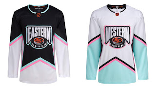
2023 NHL Reverse Retro All-Star Jerseys


2023 NHL All-Star Jerseys


The NHL just released these jerseys a few days ago.  I guess I should do a quick write up on this before we get to the Western Conference Reverse Retros.  Actually, I have them already written, Central Division will be released in February and Pacific Division will be posted in March. I know, you are dying of anticipation.

Like many of you, I had forgotten about he All-Star Game all together.  As with tradition, the format is changed every year.  This year, it seems like the NHL picks one player from each team.  That way, we have at least one member from each team...and no one gets left out...and everyone is happy.  

Then, there is fan voting to complete the rosters.  A good way for fans to pad the ballots and get half their team into their respected division.  Nothing like a third-liner at an All-Star Game, a la All-Star MVP John Scott.  

Well, there you have it. The All-Star Jerseys, a throwback to the mid-1990's design...but, you know, Reverse Retroed.

But wait, the competition format has not changed (that I am aware of). Heck, I had to look up where the game is hosted this year.  Florida, in case you had no idea either.  Anyway, for the past few seasons, the All-Star Game has been a tournament style format between the four divisions.  But, there are only two jerseys?  May I suggest something?

Remember the McDonald's NHL All-Star Muppets?  
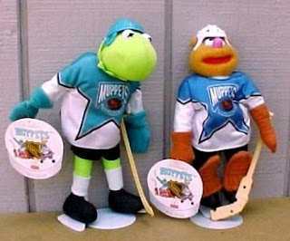
McDonald's NHL All-Star Muppets

This should be your Eastern Conference.  Yeah, change the colours a little, maybe more green on Kermit's jersey.  Or, go with orange or yellow for one Division and blue for the other.

McDonald's NHL All-Star Muppets

Then you can have something like this for the Western Conference.  Pick your four colours, mix in a little Reverse Retro powder and you have four jerseys to sell.  Just swap the word mark with the division and you are set...or just keep it as "Muppets".

Oh...wait for it...then use black (Eastern) and white (Western) jerseys for the final game.  Do that.

Then, next year Dallas can 'borrow' this design again. 

06 January 2023

2022 NHL Reverse Retro Jerseys - Metropolitan Division


2022 NHL Reverse Retros

The Metropolitan Division Reverse Retro jerseys ready for my stupid opinion. We had to wait for some teams to debut their jerseys on the ice to get a full view of the uniform.  Some of these images were hard to find...all were stolen from the internet.

Carolina Hurricanes

Carolina Hurricanes 2/10

Fail!  While it works in the black or white jersey version, the hurricane warning flags, being red, get lost and blended in to the red jersey.  It looks like two white marks instead of a C, more like "-_ANES" or "=ANES".  

Wordmark of the nickname is also a strike against this.  Imagine if Montreal went with a diagonal wordmark of "HABS".  

The greyed out storm warning flags on the waist is a good touch.  Maybe incorporate those flags around the arm.

Columbus Blue Jackets

Columbus Blue Jackets 7/10

They could have easily gone overboard with designing the uniform.  Admit it, this works.  Columbus has a history of good jersey designs and great logos.  That gives them a lot of room to play with win coming up with Reverse Retro designs.  Also, that blue trim on the bottom of the pants nicely breaks up the black of the pants and socks.  Not much more to say, I think they nailed it.


New Jersey Devils

New Jersey Devils 10/10

Nailed it!  A throwback to the Kanas City Scouts and Colorado Rockies uniforms.  Just think, if the owners of the Devils kept the same colour theme as the Rockies, this is what the Devils would have looked like in their inaugural season.  

The Devils did a great job despite having very little design changes in their logo and jersey history. Not much to play with. Okay, basically no change to their design other than changing from red/green to red/black.  Their only third jersey design is the 'Jersey' design.  Maybe next time, we see a red or white 'Jersey' design.  Even better, a blue version of the Rockies Reverse Retro

New York Islanders

New York Islanders 9/10

Yo, the Gorton's fisherman logo is back!  Back in 1995, this was all the rage...and I mean rage!  Many fans (and players) were not in favour this design.  This logo lasted two seasons before it was replaced by the old familiar circle logo. 

The fisherman logo is essentially the Islanders only exploration into a new logo.  There have only been slight variations of the circle logo, which includes just the 'NY' logo, and adding a fourth stripe on the hockey stick (originally three) to represent the four straight Stanley Cups from 1980-1983.  Meh, I think 'handcuffing' your history with, "we won four Cups"...also says "we only...and will ever only...win those four Cups".   Like, what do you do if the team wins another Cup?  Add another stripe?  That means new logo, along with the revamping the entire catalog of merchandise.  Sure that means more revenue, but now your are stuck with that 'winning identity' of four stripes with five or more victories.  See how that complicates things?  What if they go on another four Cup run?

Anyway, as much controversy the fisher logo caused in the mid-90's, this is what fans wanted.  Credit to the Islanders, this looks good.  What makes it work is the omitted teal and 'wave' stripe.  Keeping the colours to their blue and orange, with a little white to make things pop, and a nice 'swoop' stripe  brings everything togethers.  This design will work nicely as a third jersey for the team.

New York Rangers

New York Rangers 7/10

At one point, the original NYR Liberty jersey, from the mid-1990's, was the best selling jersey in the NHL.  So, it makes sense to bring this back as a Reverse Retro...again. Instead of going back tot he dark blue, they kept the Ranger blue.  Again, it works. It works because the original was a great design, sales do not lie.  It works because the Liberty logo says "New York" and is one of the best logo designs out there.

Unlike the other Original Six teams, the Rangers have done some experimenting with logo and jersey design.  Okay, very little.  They have the regular "RANGERS" wordmark, which is pretty much the only diagonal wordmark that works, only because that is all we know.  There is the "NEW YORK" word mark that, at a glance, looks similar to the Rangers design, while there is exploration of font.  

Then there is the shield logo, which looks 'wrong' because we are so used to seeing a diagonal wordmark.  The logo makes it way on the shoulders of the Liberty jerseys.  When they show the logos of teams on TV, they use that shield logo.  The Rangers' shield is the only logo consistently used that  is not the teams main logo.

Philadelphia Flyers

Philadelphia Flyers 6/10

Cooperalls!  Too bad they only wear the Cooperalls for warm-ups.  The overall (ha!) uniform looks great.  But, without the full roller hockey look, this jersey itself is kind of meh.

Like much of the Original Six, the Flyers (I know, not one of the Original Six) have a very limited pallet when it comes to logo design and jersey design.  Outside of adding a border, once, the flying P logo has not changed.  I mean, it has not changed at all.  This is their only logo, with no secondary/alternate logo.  Their only logo only comes in black with an orange dot.  Yeah, even when they had black jerseys, they use the same logo.  You can see one of the fans wearing a black jersey in the photo above.

They have a limited pallet of black, orange, and white.  The cut of their jersey, while unique, has basically gone unchanged.  Base jersey with strip running from neck down to elbow, splitting to wrap around forearms.  Finish with band around cuffs, optional band around waist.  That is it, that is their template for home and away uniforms.  Oh, and the damn numbers on the arms always cross over the strip, sometimes blending into the sleeve.  Fine, do that, but you need a contrasting border to make the numbers pop.

Okay, on special occasions the Flyers will opt for the 'traditional hockey jersey look' with stripes on the arms and waist.  But, only for special occasions like Anniversary, limited thirds, and Winter Classic uniforms.  

Pittsburgh Penguins
Pittsburgh Penguins 8/10

When the Penguins won back-to-back Cups in 1991 and 1992, they changed their logo to what is known as the "robo penguin".  They did not win a Cup until they switched back to the "skating penguin"...also, that Sidney Crosby guy might have helped.  Two more back-to-back Cups.  It has been five years since their last Championship and the robo penguin is back after 20 years.  What does this mean for their Cup runs?

The uniform looks good. While I love the yellow shoulder yokes, it maybe a little too much yellow...or maybe just enough.  At times, the Penguins uniforms look a lot like a Bruins uniform. The large yellow patches of these Reverser Retros make them look more like Boston than usual.  Yes, I get confused when I see a Pittsburgh vs Boston game.  Upon further review, the large shoulder yokes looks more like Starfleet uniforms.  Think first five seasons of Deep Space Nine and Voyager Anyway, the white trim around the yellow, especially the shoulders, work well.  Otherwise, you may be watching Captain Crosby and the crew of the USS Penguin.  Always loved the unique tapered striping on the Pittsburgh's pants.

Like most of the Metropolitan Division, the Penguins did a great job of design their Reverse Retros.  Both versions of the Penguin are great logos.  Perhaps they will bring back the yellow/white torso band from the mid-1990 third jersey design.  

Washington Capitals
Washington Capitals 7/10

The eagle logo has one annoying flaw it shares with the Red Wings logo.  It forces the C or A to the opposite side of the jersey.  This more annoying as many of the teams have sold the upper right chest area for corporate sponsorship.  The screaming eagle logo also does not scream "Capitals", but that is okay, as we get wordmark right underneath the eagle in a true 1990's diagonal striping.  

Most of the teams that experimented with a new or third jersey design in the mid-1990's had a diagonal strip.  There was new laser printing back then so they could print graphics and/or diagonal striping on the jerseys.  Before this 'laser', striping was done by knitting.  So, only horizontal striping was available.  Unless you cut the template in a way to get vertical or other fancy colour breaks (see Flyers).  

Back to this eagle jersey in black.  This is the first time we see the screaming eagle in black.  It had only appeared on the white or blue jersey, never in black.  The black thirds you are thinking of had the Capital building logo (also with different striping)...which makes sense.  Capitals. The logo appears on the shoulders on this design. Great that Washington did a Reverse Retro combining elements to something very familiar, yet very different.  Ovechkin played his first few seasons in the screaming eagle (white) and Capital (black) logo era. 

One more comment on colours.  Strange that a team from Washington DC would use blue, black, and gold as their team colours.  Glad they when back to red, white, and blue.  The previous Reverse Retro with the screaming eagle on red jersey was really good.  

07 December 2022

2022 NHL Reverse Retro Jerseys - Atlantic Division


2022 NHL Reverse Retros

The NHL and adidas designed another set of Reverse Retros for all 32 teams.  Some of these designs are really good, some are really bad.  No one asked for this, but here is my opinion on the 2022 Reverse Retros.  I have no qualifications, so feel free to disagree with my opinion.  Starting with the Atlantic Division, since all the teams have debuted their new jerseys on the ice. 
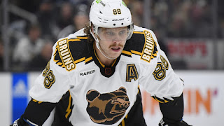
Boston Bruins

Boston Bruins - 8/10

Has there been a bad Bruins jersey?  Well, yes.  But this is not one of them.  This one works on many levels.  It brings back the 90's third jersey with the bear, this time in white.  Yeah, it looks like an MTV Liquid Television version of a bear that is about to attack Aeon Flux, but who cares...it works.  The jagged shoulder yokes and sides look like claws, or rips...rips by claws.  

Number and letter placement works, as well as the font, classic.  The 'Bruins' shoulder patch is just enough to bring everything together.  Plus, they Bruins have set an NHL record for longest home win streak, with only a handful of losses so far.  This is all thanks to a pretty good jersey design.  The Winter Classic jersey, on the other hand, is another story.
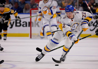
Buffalo Sabres

Buffalo Sabres - 6/10

Dude, what the hell is going on here? There is too much white.  At the same time, not enough white. The jersey itself it okay.  Very simple, they took the red/black buffalo head jersey and gave it the blue/gold treatment.  As a jersey alone, it works.  But we judge on the whole package.  This is why I waited until the entire uniform is on the ice.

The problem here is the helmet, it needs to complements something.  Maybe have white helmets so everything is white.  Then strap on some Oakland Seals (foreshadowing) white skates and you may have something.  How about blue pants to work with the blue helmet.  The little blue strip on the hem breaks things up at little, but it needs more contrast.  Call me crazy, but how about blue pants with yellow helmet?   The white gloves work.
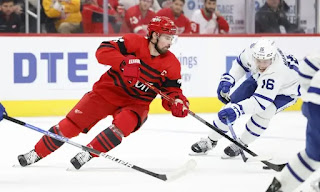
Detroit Red Wings

Detroit Red Wings - 4/10

This is the problem when your team only has two colours...well, really one colour.  In Detroit's case, red.  So, what do you do?  You add a 'neutral' colour like black, sometimes grey or silver.  This is black/red is throwback one of their original Detroit Cougars design...which was red/white, of course...and 'retro-ed' during 1991-92 Season for NHL's 75th Anniversary.

Another 'issue' with the Red Wings' jersey history is, they kind of only have one design.  A very iconic design.  The early jersey, or sweater, designs were usually simple striping, achieved by changing the yarn as it is knitted.  The classic striping is a tradition that is seen in hockey jerseys since.  Bro, you guys need a real secondary logo.  Heck, even a risky third jersey with a goofy logo, like...an octopus.

One nice detail, instead of just a letter, the captain's "C" is on a patch.  And...for the first time in a while on the correct side of the chest.  Damn it, do not get me started on C/A placement.
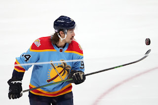
Florida Panthers
Florida Panthers - 10/10

This one is a winner!  Everything works on this design.  As a bonus is corrects some serious mistakes that are on their regular jerseys.  I am talking about shoulder numbers.  

The Panthers win by using their almost forgotten secondary logo, the sun, stick, and palm tree.  A great secondary logo that just screams "Florida hockey".  Combined with the original layout of their inaugural threads, and light blue similar to the 2009 thirds, this works.  A new logo with a sun and FLA ties everything together.

Montreal Canadiens

Montreal Canadiens - 7/10

Oh, so close.  Overall, very good. Like Detroit, Montreal is limited in retro selection as their jersey design has not really changed through out the years.  Here they try to use a light blue.  While for the most part, it works simply for trying a new colour, it needs a little more to really make it pop.

A little red to bring everything together.  Perhaps outlining the numbers and letters.  Or, maybe...dear I say it, at another stripe.  Again, the design follows the same layout as every jersey in their history, handcuffed by tradition.  Also, Florida wins the light blue jersey battle.
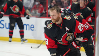
Ottawa Senators
Ottawa Senators - 4/10

This is what we call 'safe design'.  Not much outside the box thinking here.  You have that gold, use it.  Throw in some gold trim,.  Heck go with a gold jersey like Vegas.  Even some white trim can help this pop.  That red swoop across the body just gets lost.  Much like their "SENS" jersey this just looks like a bootleg jersey.

Tampa Bay Lightning

Tampa Bay Lightning - 8/10

Yo, way to full nineties on this.  Basically a re-colour of their late 90's thirds with the 'storm' and lightning motif.  Even the numbers and letters look like lightning bots.  It passes ugly and crosses over to awesome.

It is refreshing to see something other than a "wait, is that a new Leafs uniform" look from the Lightning.  Their regular uniform is just a Red Wing design with Maple Leaf colours.  Wait, did Yzerman have anything to do with that?

Toronto Maple Leafs
Toronto Maple Leafs - 6/10

Another Original Six Team that suffers from tradition and lack of colour options. Even with those limitations, the Leafs did a good job with what they had to work with.  I think this is the first time we have seen white shoulder yokes on their blue jerseys.  With the contrasted shoulder yoke, it is a real reverse of their retro whites.

It looks good because it is safe.  Too bad Florida and Montreal used light blue.  Might be interesting to see something other than the blue/white combo.  Yes, they added grey for their last retro design.  Like Detroit, Toronto is limited to basically one colour to play with.  Yeah, I know what you are thinking, 'what about great'...when then they will look like bootleg Canuck jerseys. 


11 April 2021

Stanley Cup, Outdoor Games, & Olympics

 Usually around this time of year we are near the end of the NHL season and gearing up for the Stanley Cup Playoffs.  The weeks leading up to this time of year are usually bombarded by stupid campaigns by the NHL, like "Because it's the Cup".  Damn, it I hate that campaign...almost as much as "Is it October, yet?".  Who writes this crap?  Who greenlights this crap?  And, why do they keep using this amateur slogans to promote a game that is losing its core audience.

Anyway.  This is something I observed a few years ago and the pattern is still going strong.  Notice that teams playing outdoor games have a very good chance to be in that year's Stanley Cup Finals.  Here is a list of NHL outdoor games on Wikipedia that you can check.  And, a list of Stanley Cup Champions and Finalists.  

Let me break it down.

- 1954, Detroit Red Wings have an exhibition outdoor game with the Marquette Prison Pirates.  The Red Wings go on to win the Stanley Cup that year against the Montreal Canadiens.

We get some outdoor games where this theory does not work out, but hold on...

- 2008 Winter Classic, Pittsburgh Penguins versus Buffalo Sabres.  Penguins go on to meet the Red Wings in the 2008 Stanley Cup Finals

- 2009 Winter Classic, Red Wings vs Blackhawks.  Red Wings meet Penguins in 2009 Stanley Cup Finals

- 2010 Winter Classic, Flyers vs Bruins.  Flyers in 2010 Finals with Blackhawks

See it?  The Winter Classic pretty much guaranteed a spot in the finals.  No Cup win, but very close.  Okay, a few more games were played in the open with no results that I can skew towards my theory.  But, it happens again, this time we have Cup winners for outdoor teams.

- 2014 Stadium Series between the Anaheim Ducks and Los Angeles Kings.  The Kings would go on to win their second Cup that summer...against the New York Ranger...who also played in the...

- 2014 Stadium Series.  The Ranger actually played two outdoor games, one against the Devils, other against the Islanders.

- 2015 Winter Classic, Blackhawks vs. Capitals.  Chicago wins another Cup, this time defeating the Lightning in the Finals

Skipping a head to make me sound like a genius.  I should also mention that there are up to four games being played outdoors at this point.

- 2017 Stadium Series, Philadelphia Flyers vs Pittsburgh Penguins.  Yeah, Penguins lifting the Cup at the end of the Finals.

- 2018 Stadium Series, Toronto Maple Leafs vs Washington Capitals.  Come on, you did not think the Leafs were going deep in the playoffs, did you?  Of course not.  The Capitals win their first Cup

- 2019 Winter Classic, Bruins vs Blackhawks.  Boston make it to the Finals but just fall short, as the St. Louis Blues win their first Cup.

- 2020 Winter Classic, Nashville Predators vs Dallas Stars.  Crazy pandemic year with whacky playoffs, but the Dallas Stars make it to the Finals, but are defeated by Tampa Bay.

Here we are at 2021, and we have four teams that played in two outdoor games.  Vegas Golden Knights, Colorado Avalanche, Philadelphia Flyers, Boston Bruins.  Will one of these teams make it to the Finals, possibly win it all?  Currently the Avalanche and Golden Knights are at the top of the same division.  Bruins are in a playoff spot, with the Flyers just on the outside looking in.

-----

Wait, I have more!

Three Canadian cities have hosted the Olympics.  The result?  Top of the league the next season and a Stanley Cup Championship (almost)

1976 - Montreal hosts the Summer Olympics.  The next year, 1977, the Montreal Canadiens are at the top of the league.  They would have been awarded the Presidents' Trophy, if it existed then.  But, more importantly, they go on an win the Stanley Cup.  Okay, I know this was during their dynasty years (1976-1979), and no one was getting around the Canadiens.  My theory still stands.

1988 - Calgary hosts the Winter Olympics.  The next year, in 1989, the Calgary Flames win their second Presidents' Trophy in two years, and first Stanley Cup.

2010 - Vancouver is host to the Winter Olympics.  The Canucks would win back to back Presidents' Trophies in 2011 and 2012.  They reach the Stanley Cup Finals in 2011 (year after Olympics) and came with in a game of winning it all, losing in Game 7 to the Boston Bruins.  

-----

There you go, my Stanley Cup, Outdoor Game, and Olympics theory.


20 June 2020

NHL Jersey Numbers Do Not Belong on the Shoulders

Hey, another hockey related post.  Here we are, one hundred days since the last NHL game played before the league shut everything down due to the global pandemic.  While the league and its players are getting ready to restart play, we would be celebrating the Cup Champion around this time of the year.

So, why are we here.  Jersey numbers.  Specifically, the location of jersey numbers.  We can all agree that number do not belong in the front of the jersey.  Currently, I think only the Buffalo Sabres are the only team with numbers on the front, on the right chest.  This looks stupid.  Heck, even Jack Eichel is complaining about his disappointment in the Sabres organization because of the numbers being on the front of the jersey.  Yeah, pretty sure that is what he was disappointed about.  I mean, this is why Buffalo is not getting into the playoffs...where are they going to put the Finals patch?

Anyway, there is another place where jersey number simply do not belong.  The shoulders.  There are a few teams that do this, mainly on their thirds.  I am too lazy to research which exact ones.  Florida is the one team that has numbers on their main home and away uniforms.

Florida home jersey (pic stolen from internet)
Note the stupid numbers on the shoulders. A total eyesore. There is a very simple fix to this.  The Panthers have these beautiful patches on the upper sleeve that can, and should, be placed on the shoulders.  This will leave room for numbers where they belong.  Here, I did a little mock up for you...and the Florida Panthers.

Cleaner look
Look how clean that looks.  I bet Aaron Ekblad would love this.

Another one that violates aesthetics is the Penguin's third jersey. 

WTF? (pic also stolen from internet)
Yes, I know the history of the jersey. It did not look good in the 80's, it does not look good now, and it will never look good to have numbers on the shoulders.  It just looks so top heavy.  There is no excuse here, not like there are patches on the shoulders that need to be moved...and we already proved that moving patched is easy peasy.  Again, simple here.  Numbers go on the upper sleeve.

So much better
Quick mock up, I even took the time to change the colours so they pop. 

There might be another team or two doing this.  But, I think you get the idea of what I am getting at.  Just look at how much cleaner and balanced the jerseys look when the numbers are properly placed on the upper arm. 

Next time, maybe we talk about fixing some jerseys that just missed the mark.

04 May 2020

My Crazy Idea for NHL Restart

By now, we should be into the second round of the Stanley Cup Playoffs.  It is usually that exciting time of year for hockey fans.  But, like you, we are sitting at home watching random hockey related videos to try and fill that void in an effort to escape the reality of the global situation.

A few weeks ago, I came up with this crazy idea to salvage the season and award a champion.

First, we will follow safety regulations and will have this event  happen at a neutral site or sites.  It really does not matter as much as this wacko format.  Buckle up, here we go.

We go right into playoffs.  All stats will count towards Playoffs, so Alex Ovechkin will have to wait until next season to pass Mike Gartner in all-time goals list.

Sure, there will be conditioning and practices for about two weeks, but when it starts, it starts...right into a 32 team bracket.  Yeah, there are 31 teams right now...therefore, as defending champion, St. Louis Blues get a bye in the first round.  Okay, you can argue Boston with their top overall seed and eventual President's Trophy.  But, this is my stupid idea...and it gets stupider.

Crude Playoff Bracket
The bracket will be filled based on current Conference standings.  The first seed in each Conference will play the last (16) team.  It just happens that the Blues are first in the West, they will play the winner of Nashville vs Vancouver (8 vs 9)

There will be no re-seeding after each round.

The First Round will be a Best-of-Three format.  This will also act as your end of the season and final push into the traditional 16-team playoffs.  Every team gets a shot at the Cup, even Detroit.  Crazy, you say?  Well, we are living in crazy times, my friend.

Like back in the day, Conferences will alternate game days.  Example:  Day 1, all East games.  Day 2, all West games.  Day 3, all East...etc.

Here is a simulation of First Round with some upsets.

Round 2
The Second Round is Best-of-Five format.  I will explain why later on.  This is where the 'normal' playoffs begin with the 16-teams.

Round 3


Yes, I totally made all the Western Canadian teams get into the next round.  Come on, Battle of Alberta in the Playoffs.  We had the Battle of Pennsylvania and Battle of Ontario in the last round.  This is all fantasy, anyway.

With eight teams left, we go to standard Best-of-Seven from here on out.

Round 4
Okay, the only one that makes any sense at this point is Boston.  Three of the final four are Canadian team are highly unlikely...even in the CFL.

Finals

Totally dreaming of an All-Canadian Finals.  I will end it there, but you already know who I want to win.  Anyway, you get the idea.

Why the Best of 3 - 5 - 7 - 7 - 7 format?  In this format of 32 teams, you would need 17 wins to win the Cup, instead of the traditional 16 wins.  St.Louis, with the First Round bye, would need 15 wins.

So, there it is.  Every team gets to play at least two games and a chance to compete for the Cup.  Season saved and we have a legitimate champion.\

The longest this format can can go, with all series going the distance, and no rest days in between rounds, is 62 days.  If every series is a sweep with no rest days, we can crown our champion in 34 days.

This works for the NBA, as their season was cut short, as well.  The NBA schedule is usually about a week or two behind the NHL schedule.  With 30 teams in NBA, the top seeds in each Conference get a first round bye, they play winner of 8 vs 9.  Done!

You can thank me later.